The New York Times: Upgrading the podcast directory
A redesign of The New York Times' podcast directory header, rebuilt around a dynamic, artwork-driven browsing experience for listeners.
01 · Overview
Podcasts included
Past and current shows
Core tasks
Browse, discover, listen
Dynamic directory
One browsing system
Unsolicited redesign
This concept was created independently and is not affiliated with or endorsed by The New York Times.
Copyright
Podcast-platform logos belong to Apple, Spotify, Google, and Pocket Casts. The remaining photography and New York Times brand assets belong to The New York Times.
Great podcasts were difficult to discover
The New York Times produces journalism-led podcasts across history, current events, and culture. While The Daily was prominently featured, visitors could not easily browse other shows from the homepage.
The directory required too much navigation to understand a show or begin listening, and it did not use podcast artwork to help people distinguish one series from another.
Turn listening habits and pain points into a browsing system
I listened to 1619, Popcast, and Still Processing to understand the catalog beyond The Daily. That made one content decision especially clear: the journalists and hosts needed to be part of the experience.
Empathize
I listened to several shows I had not heard before and reviewed NPR, Gimlet, Relay FM, and TWiT to understand how other networks support discovery.
Define
I translated friction—extra clicks, indistinguishable shows, and weak browsing—into goals for recognition, discovery, listening, and measurable efficiency.
Ideate
I cataloged The Times’s podcasts, sketched options, and centered the concept on artwork that people could swipe to change the active show.
Prototype
I developed the visual system in Sketch, then used Keynote to communicate the motion, state changes, and emotional effect that static screens could not show.
Test
In a real product context, I would test discoverability, comprehension, swipe behavior, time to play, successful subscriptions, and exploration beyond The Daily.
Study how podcast networks support discovery
I compared NPR, Gimlet, Relay FM, and TWiT. TWiT was crowded, but made shows, subscriptions, and recent episodes easy to reach. I wanted that efficiency with a more focused, dynamic header.
Define what the redesign should improve
I listed pain points in Miro, inverted them into goals, and identified measures for success. The concept needed to reduce clicks, improve recognition, and support browsing and listening without sending people through unnecessary pages.
Make artwork the interaction
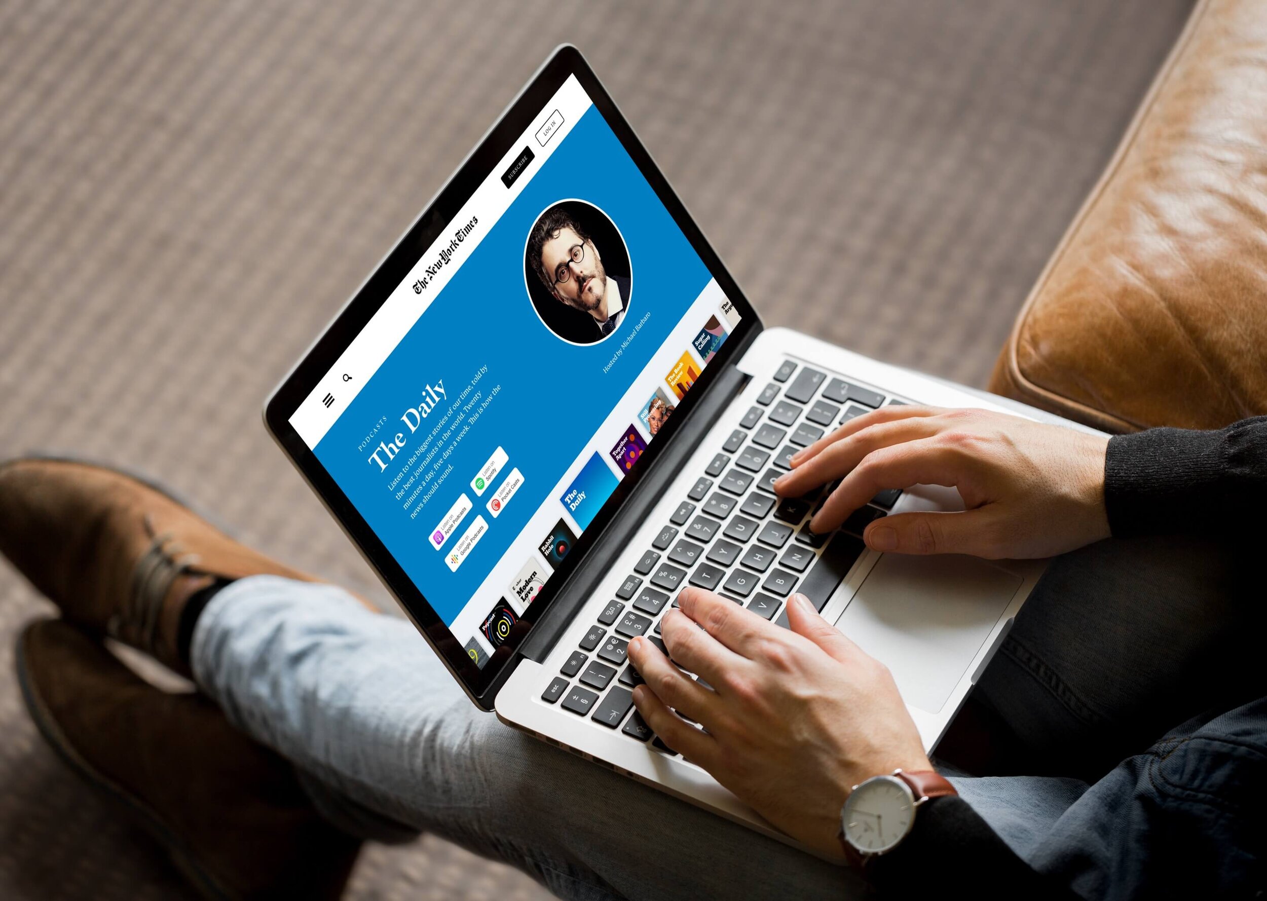
I cataloged current and past podcasts before sketching. The wireframe uses a swipeable artwork carousel: selecting a show changes the header, enlarges the active artwork, reveals the host and description, and brings listening options and recent episodes into the same surface.
Build one system for different shows
I used available typefaces with a similar editorial character, changed Subscribe to black to reinforce brand hierarchy, added Log In as a secondary action, rewrote show descriptions, included host headshots, and standardized the listening badges. Each show’s artwork color becomes the dynamic background.
A streamlined design that’s easy to browse, discover, and listen to podcasts.
A dynamic directory that changes with every show
I created the final prototype in Keynote because static screens could not fully communicate the interaction. The video shows how artwork, color, descriptions, hosts, listening platforms, and episodes work together as people move through the catalog.
The prototype makes the hypothesis testable
This concept brought 20 NYT podcasts into 1 directory built around 3 core tasks: browse, discover, and listen. Those numbers describe the project’s scope, not evidence that people would discover more shows.
My hypothesis is that bringing the catalog into a single browsing system would make new shows easier to find and encourage discovery beyond The Daily.
I’d test whether people can discover a new show, understand what it offers, start an episode, and subscribe successfully. Time to first play, subscriptions, and the number of shows explored would become useful signals only after the discovery experience proved clear.
The project reinforced that a prototype is most useful when it turns assumptions into something stakeholders and users can evaluate.