LinkedIn: Reimagining the iOS app with Game of Thrones
A LinkedIn iOS redesign using UX writing and product design to make professional check-ins faster through a Game of Thrones mash-up.
01 · Overview
Content sections
Sorting and filtering system
Primary screens
Connected mobile experience
Core destinations
Today, Collections, Inbox
Unsolicited redesign
This concept was created independently and is not affiliated with or endorsed by LinkedIn.
Copyright
People in the designs are based on characters from George R.R. Martin’s A Song of Ice and Fire. Icons are from SF Symbols and the Noun Project. The LinkedIn name and logo belong to LinkedIn. The Tower of Joy photo is from Wikipedia. Except for the Wildfire app, the remaining Game of Thrones imagery belongs to HBO and WarnerMedia.
A busy feed makes a simple check-in feel like work
LinkedIn gives people many reasons to return, but the Home experience mixes posts, recommendations, reactions, comments, and promotions without clearly showing what is new or most relevant.
Bookmarks, insights, messages, and notifications also live in separate places. The result is unnecessary effort for people who want to understand what changed, respond, and move on.
How I approached the redesign
I used Design Thinking to organize the work while staying honest about the limits of an unsolicited redesign. The framework gave the project structure without implying research or validation I didn’t have.
Empathize
I began with the friction I experienced while trying to check LinkedIn quickly.
- Used my own recurring frustrations as the starting hypothesis
- Acknowledged that I didn’t have internal research or product data
- Limited the scope to the screens needed to tell one coherent story
Define
I separated the broad frustration into two clearer user needs.
- Make new network activity easier to scan and filter
- Make bookmarks, insights, messages, and notifications easier to reach
- Reduce the effort required for a useful check-in
Ideate
I explored an information architecture that could create shared value for people and the business.
- Offer focused feeds by update, post type, and recommendation
- Use expert curation for discovery and promotion
- Replace My Network with Collections
- Combine notifications, messages, and insights in one Inbox
Prototype
I wrote and designed the system across the key iOS screens.
- Created 21 sections for LinkedIn Today
- Renamed and standardized interface terms
- Used consistent card patterns, icons, profile photos, and search behavior
- Built the Game of Thrones narrative into the content—not just the visuals
Test
This concept remains a hypothesis. In a real product environment, I would test whether the new structure helps people complete a check-in with less effort.
- Measure task completion and time on task
- Track navigation errors, sessions, and retention
- Validate terminology, filtered feeds, Collections, and the unified Inbox
The best redesign doesn’t add features—it adds order.
21 sections, one system
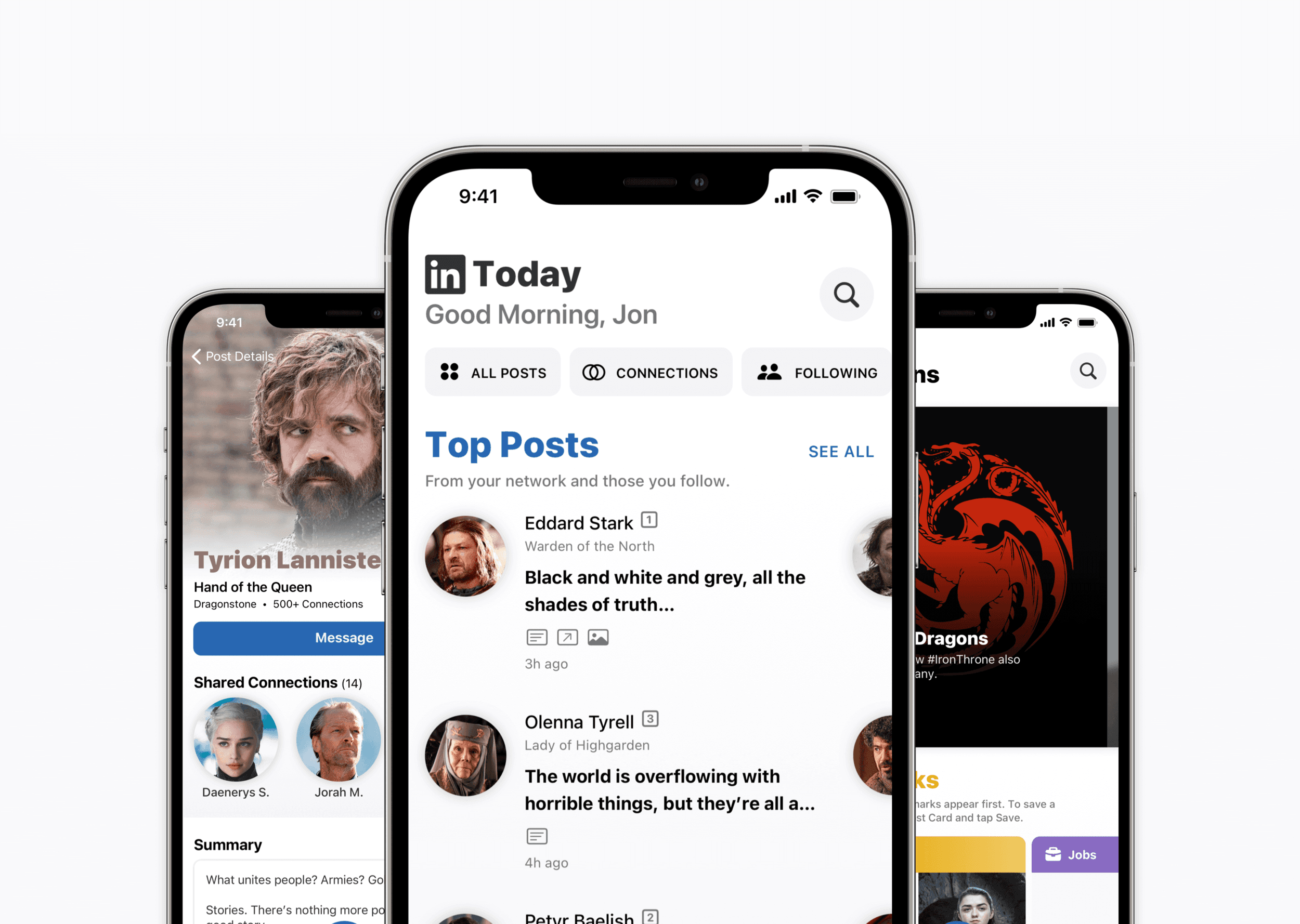
I designed and wrote 21 sections to help people sort and filter posts by update, post type, or recommendation. I used Game of Thrones instead of stock photos because its familiar cast, relationships, and titles made the professional-network scenarios easier—and more fun—to understand. Select any image to inspect the interface details in a lightbox.
What holds the system together
These decisions turn a collection of redesigned screens into one coherent product system.
Specific names
I renamed Home to LinkedIn Today, My Network to Collections, and Pages to Company Profile so every destination describes what people will find there.
Focused feeds
I organized content by update, post type, and recommendation so people can choose what they want to scan before entering a filtered feed.
Useful collections
I made bookmarks and recommendations easier to reach by giving them one destination instead of scattering them across the app.
One inbox
I combined notifications, messages, and insights behind a segmented control so incoming information can be reviewed and cleared in one place.
Reusable patterns
Consistent cards, round profile photos, icons, terminology, and search behavior make new screens feel familiar without becoming repetitive.
Clear promotion
I separated promoted actions from primary actions and used LinkedIn’s brand colors so paid content remains recognizable instead of imitating organic posts.
Familiar iOS behavior
I used back labels, swipe actions, and search controls that transform while scrolling so the redesigned screens feel new without requiring people to relearn the app.
Explicit actions
I changed Accept to Connect and kept contextual actions close to the content so labels describe what will happen—not merely confirm a tap.
Purposeful tab bar
I used a raised Post button to emphasize sharing and distinguish LinkedIn from other apps, while acknowledging that the pattern would be more complex to develop.
The system extends beyond LinkedIn Today
The remaining screens carry the same content, naming, navigation, and card decisions through the rest of the check-in experience.
LinkedIn Today turns one feed into a useful starting point
I renamed Home to LinkedIn Today and created a faster way to scan new activity or enter a focused feed. The final prototype brings the revised navigation, content, and interactions together.
Sorting and filtering turn a noisy feed into a fast check-in.
A clearer system is still a hypothesis until people use it
This project produced a connected system spanning 21 content sections, nine primary screens, and three core destinations. Those numbers describe the scope of the work—not evidence that the redesign would improve engagement.
My hypothesis is that focused feeds, clearer destinations, consistent terminology, and a unified Inbox would help people understand what changed and complete a useful LinkedIn check-in with less effort.
I would compare the concept with LinkedIn’s existing experience by measuring task completion, time on task, navigation errors, and comprehension of Today, Collections, and Inbox. Session frequency and retention would become useful signals only after the core experience proved easier to use.
The project reinforced that interface writing and information architecture cannot be separated. Clearer labels help only when the underlying content is organized around what people came to do.