Berkshire Hathaway: Redesigning a decades-old website
A ground-up redesign of Berkshire Hathaway's notoriously plain-text website, backed by a full UX audit and new information architecture.
01 · Overview
Unsolicited redesign
This concept was created independently and is not affiliated with or endorsed by Berkshire Hathaway.
Copyright
The Warren Buffett photograph belongs to Wall Street Playbook. The Kiewit Plaza photograph is by JonClee86 on Wikipedia. Berkshire Hathaway and subsidiary brand assets belong to their respective owners.
Backlinks
Website audit (2020)
Referring domains
Website audit (2020)
Audience groups
Shareholders, journalists, and readers
A powerful company offered visitors almost no guidance
I visited Berkshire Hathaway’s website looking for information about its airline holdings. I did not find the answer, but I found a site built almost entirely from plain-text links and PDFs.
It loaded quickly and carried enormous authority, yet lacked global navigation, meaningful headings, responsive behavior, descriptive copy, search, imagery, and clear paths for shareholders or journalists.
The website is for its users—not Berkshire Hathaway.
Use evidence to decide what the website should become
I treated the redesign as a content, architecture, and trust problem—not a cosmetic makeover. Research and an extensive audit helped me separate what made the site distinctive from what made it difficult to use.
Empathize
I studied Berkshire Hathaway, its subsidiaries, Warren Buffett’s public persona, and the information shareholders, journalists, and interested readers were already seeking.
Define
I combined the audit and research into prioritized pain points, then converted those issues into goals for trust, navigation, comprehension, and task completion.
Ideate
I reorganized the site around 3 audiences and mapped which pages should be added, renamed, removed, or combined.
Prototype
I moved from a content-first wireframe to a restrained visual system designed to feel credible, enduring, and recognizably Berkshire Hathaway.
Test
In a real product context, I would test findability, comprehension, shareholder task completion, mobile navigation, and confidence in the company’s digital presence.
Understand the company behind the website
I reviewed Berkshire Hathaway’s subsidiaries, read background material, and watched Becoming Warren Buffett. Warren Buffett’s frugality helped explain the site’s restraint, but restraint did not need to mean neglecting visitors.
Audit what was working, missing, and difficult
The site was exceptionally fast, secure, and authoritative. Those strengths coexisted with missing metadata, inaccessible mobile behavior, weak labels, no content hierarchy, and an information architecture that forced users to interpret a long list of documents.
Keep
Speed, directness, security, and the company’s understated character
Improve
Navigation, responsive behavior, metadata, page structure, labels, content, and trust signals
Prioritize the problems before designing
I grouped overlapping audit findings, used dot voting to prioritize urgent issues, and inverted the strongest pain points into goals and potential success measures. That kept a very large problem from becoming an unfocused redesign.
Reorganize the site around real audiences
Without enough evidence for personas, I used three practical audience groups: shareholders first, journalists second, and people interested in Warren Buffett third. The resulting sitemap added foundational pages, simplified labels, consolidated thin content, and moved time-sensitive information into searchable news.
Give the content a clear hierarchy
The wireframe prioritizes reports, letters, filings, and news while adding enough company context for first-time visitors. I then developed a restrained visual system that felt modern and distinguished without turning the homepage into a glossy marketing campaign.
A clearer homepage built around shareholder priorities
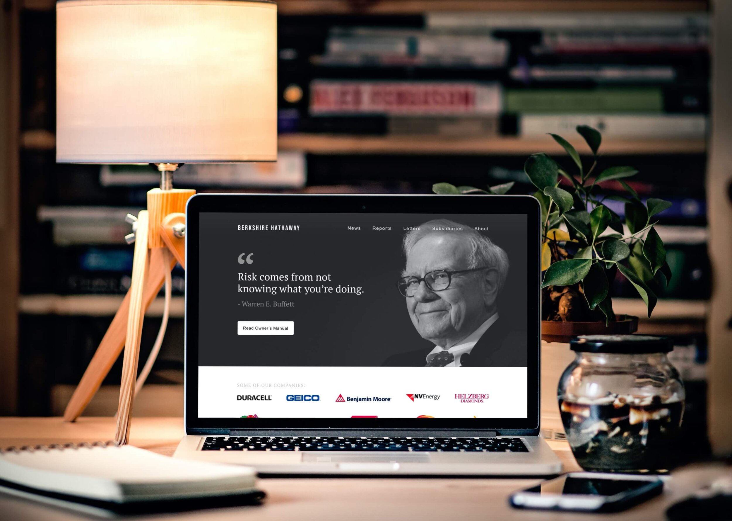
The final design keeps Berkshire Hathaway’s directness while giving visitors a real navigation system, clearer company context, prominent investor actions, recent news, and a complete footer.
I wrote primarily for shareholders, then made sure journalists and people interested in Warren Buffett could understand the company and reach important information without deciphering a page of links.
Success does not make the user experience irrelevant
The audit found 4.3M backlinks from 17K+ referring domains. Those figures describe the website’s reach, not whether people can use it. This concept reorganized the experience around 3 audience groups: shareholders, journalists, and readers interested in Warren Buffett.
My hypothesis is that clearer navigation, stronger company context, and more prominent investor actions would make important information easier to find without losing Berkshire Hathaway’s understated character.
I’d compare the concept with the existing website by measuring task completion, time spent finding shareholder information, mobile navigation errors, understanding of the company’s structure, and confidence in the site.
The project reinforced that preserving a brand’s character doesn’t require preserving its friction. Restraint can coexist with clearer structure and navigation.