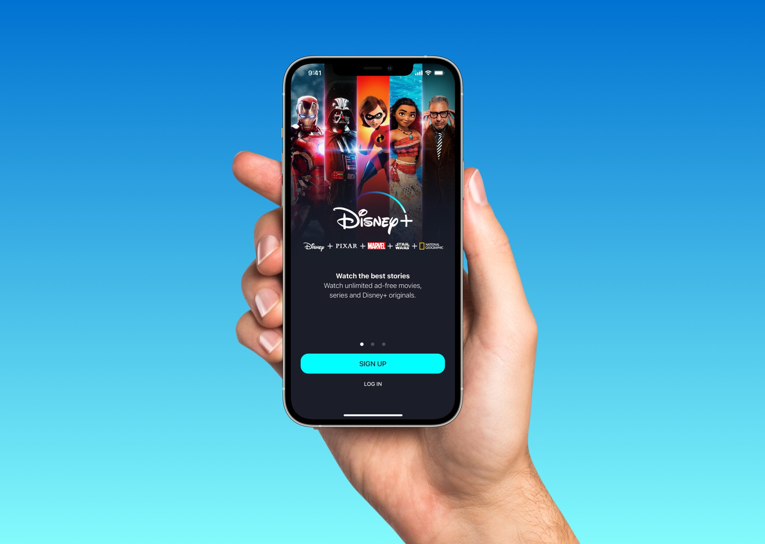
Disney+: Writing a better sign-up experience for iPhone
A rewrite of the Disney+ iOS sign-up flow, screen by screen, built to remove friction and make every single word truly pull its weight.
01 · Overview
Screens redesigned
Sign-up through home navigation
Sign-up steps
Account to subscription
Content principles
Applied across the flow
Unsolicited redesign
This concept was created independently and is not affiliated with or endorsed by Disney.
Copyright
Disney+ and the imagery shown in the redesign belong to Disney. The interface uses Apple SF Symbols.
Sign-up copy should reduce uncertainty—not create it
The Disney+ flow needed to be more benefit-oriented and supportive at each step. Unclear, complicated, or unhelpful language can make people hesitate before they experience the service.
People needed to understand what Disney+ offers, what information is required, and what will happen next without reading more than the moment demands.
Let every word earn its place
I used Design Thinking to organize the rewrite while staying honest about the limits of an unsolicited redesign. I also used Apple’s Human Interface Guidelines to check platform conventions, including the treatment of legal text.
Empathize
I reviewed the sign-up flow as a new subscriber and looked for moments where unclear or unsupported copy could increase hesitation.
Define
I focused the problem on helping people understand the value, requirements, and next action at every step.
Ideate
I explored benefit-led headlines, explicit labels, concise legal copy, and consistent primary and secondary actions.
Prototype
I rewrote and redesigned six iPhone screens, using the words to guide hierarchy, interaction, and visual decisions.
Test
In a real product environment, I would compare comprehension, completion time, errors, drop-off, and subscription conversion.
Clear, concise, and useful words on every screen deliver a better experience.
6 screens, one clear conversation
I rewrote the flow so each screen answers the question a new subscriber is most likely to have at that moment. Select any image to inspect the details.
Lead with benefits
I explained what people gain before asking them to create an account.
Name the input
Visible field labels keep requirements clear before and after someone starts typing.
Describe the action
Buttons communicate the next step instead of relying on generic continuation language.
Reveal details in context
Payment information appears when it becomes relevant rather than competing with plan selection.
Label navigation
SF Symbols work with visible tab labels so icons do not have to communicate alone.
The words guide the experience
The final prototype combines the 6 screens and shows how the writing supports hierarchy, interaction, and visual design from the first promise through the home screen.
A clearer path still has to earn completion
This concept redesigned six screens spanning sign-up, plan selection, payment, and the first home screen. It organized the experience into four steps and applied five content principles across the flow. Those numbers describe the scope of the work—not evidence of higher conversion.
My hypothesis is that a clearer offer, visible progress, and a consistent action hierarchy would reduce uncertainty and help people complete the Disney+ sign-up process with fewer errors.
I would compare the concept with Disney+’s existing experience by measuring offer comprehension, task completion, time on task, field errors, and abandonment at each step. Completed subscriptions would become a meaningful business signal only after the experience proved easier to understand and complete.
The project reinforced that sign-up copy and interaction design cannot be separated. Every message should reduce uncertainty and make the next step feel expected.
The best sign-up copy helps people move forward without having to stop and interpret it.