Frontera: Positioning gourmet Mexican food at home
A content strategy for Frontera’s Mexican grocery brand, rebuilt around one clear position: gourmet Mexican food at home.
01 · Overview
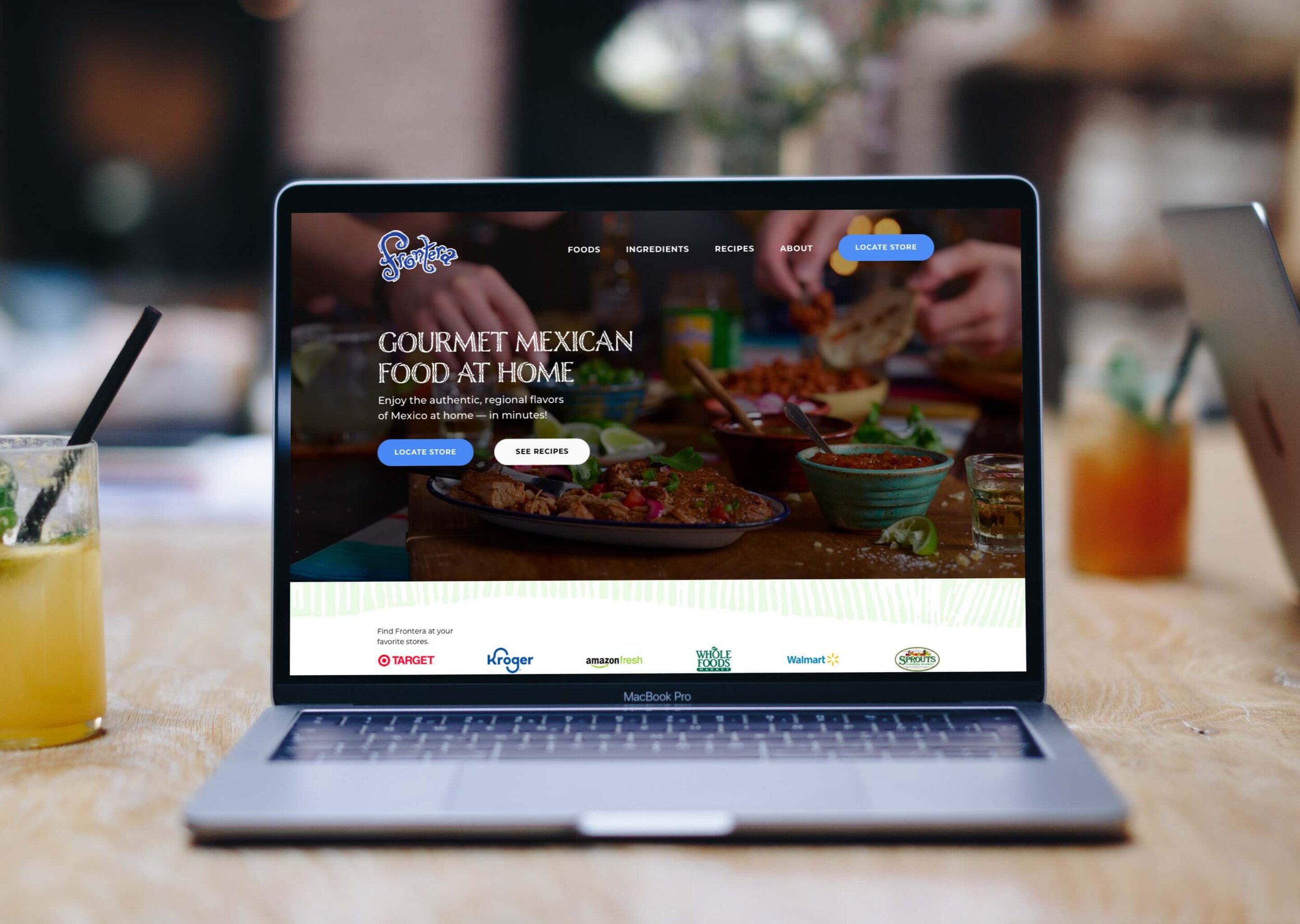
Homepage sections
One connected brand story
Unclear exits removed
SmartLabel and Ready Set Eat
Brand position
Gourmet Mexican at Home
Unsolicited redesign
This concept was created independently and is not affiliated with or endorsed by Frontera or Conagra Brands.
Copyright
Ingredient and flavor photos are from Unsplash. Ornaments are from Frontera Cocina. All other brand and product photography belongs to Conagra Brands.
Authenticity gets lost without a clear position
Frontera produces ready-to-eat Mexican food rooted in regional ingredients and authentic flavors, but its website did not clearly explain how the brand differed from competitors.
People comparing products needed a reason to choose Frontera. Without a focused content strategy, the brand’s history, ingredients, and at-home convenience could become disconnected details instead of one persuasive story.
Build every section around one useful promise
I believed that a content strategy centered on Frontera’s roots in Mexico, regional ingredients, authentic flavors, and at-home convenience could make the brand’s value easier to understand.
Empathize
I began with the needs of people comparing Mexican grocery brands and acknowledged that I did not have access to Frontera’s customers or internal research.
Define
The central problem was positioning: the website showed products without clearly explaining why Frontera was worth choosing.
Ideate
I explored a content strategy grounded in Frontera’s Mexican roots, regional ingredients, authentic flavors, and at-home convenience.
Prototype
I rewrote and redesigned five homepage sections, using one message—“Gourmet Mexican at Home”—to connect navigation, product discovery, brand story, community, and the footer.
Test
In a real product environment, I would test whether people understand the positioning and can find products and retailers more easily, then measure whether that clarity contributes to sales.
Clarify the promise
Make products easier to discover
Explain what makes Frontera different
Connect the brand to life at home
Finish with clearer navigation
Without a clear position, authenticity gets lost on the shelf.
Gourmet Mexican at Home
The complete homepage brings 5 sections together around one position. It explains what Frontera offers, why it is distinctive, where to buy it, how it fits into life at home, and where to go next.
A strong position is only useful when people understand it
This concept reorganized five homepage sections around one brand position and removed two unclear exits to unrelated destinations. Those changes describe the scope of the redesign—not evidence that it would increase retailer clicks or sales.
My hypothesis is that a homepage built around “Gourmet Mexican at Home” would help people understand what distinguishes Frontera, find relevant products and retailers, and remember the brand’s position.
I would compare the concept with Frontera’s existing experience by measuring position comprehension, product-finding success, navigation errors, and successful retailer navigation. Retailer clicks and sales would become useful business signals only after the experience proved easier to understand and use.
The project reinforced that positioning, information architecture, and copy must work as one system. A strong promise helps only when every section supports it and gives people a clear next step.
By positioning Frontera as “Gourmet Mexican at Home,” every section can support the same reason to choose the brand.