Ally Financial: Redesigning the website for a tech-savvy audience
A design-thinking sprint that rebuilds Ally Financial’s homepage around the tech-savvy, online-only audience its existing experience didn’t clearly address.
01 · Overview
Research sources
Website, benchmarks, and app reviews
Proto-personas
Primary to tertiary
Banking apps
App benchmark (2020)
Unsolicited redesign
This concept was created independently and is not affiliated with or endorsed by Ally Financial.
Copyright
Ally Financial’s name, logo, interface, and photography belong to Ally Financial. Screenshots from the Ally app came from my personal account.
The audience and the message were pointing in different directions
Ally began as GMAC in 1919 and now provides online-only banking, investing, home loans, and auto financing. That range needs clear marketing because customers cannot walk into a branch and ask someone to explain it.
The homepage leaned heavily on automotive imagery. That made sense for one large part of the business, but it did not represent the tech-savvy people most likely to value Ally’s digital financial products.
The mismatch between audience and message was hiding in plain sight.
Use evidence to turn an audience assumption into a focused design strategy
I ran a one-week sprint using Design Thinking. Because this was an unsolicited redesign, the research and personas remained working hypotheses that would need validation in a real product environment.
Empathize
Audit the website, competitors, rankings, and customer reviews.
Define
Turn recurring pain points into goals, measures, and proto-personas.
Ideate
Explore naming, architecture, trust signals, and page hierarchy.
Prototype
Build the sitemap, wireframe, style guide, and final homepage.
Test
Validate the assumptions and measures in a real product setting.
Audit the market and listen for recurring needs
I reviewed Ally’s website, nine banking apps in the 2020 Finance ranking, competitors, and customer feedback. I filtered app reviews to the constructive middle—two through four stars—and used that evidence to examine whether the audience mismatch appeared beyond my own first impression.
Prioritize pain points before drawing solutions
I mapped observations by task, grouped them into themes, and weighted urgent problems through dot voting. The highest-priority issues became user and business goals, then potential measures of efficiency, effectiveness, or satisfaction.
Design for one primary audience while accommodating others
The research suggested three working user types. Ted Techie became the primary proto-persona, with Mary Millennial and Harry Hesitant as secondary and tertiary audiences. That hierarchy gave the redesign a clear point of view without pretending the assumptions were validated personas.
Build the architecture and trust story together
I unified service names under Ally, documented every destination in a sitemap, and used awards and testimonials to support confidence. The wireframe reduced visual noise, while the style guide tightened the palette and used one type family to improve consistency and performance.
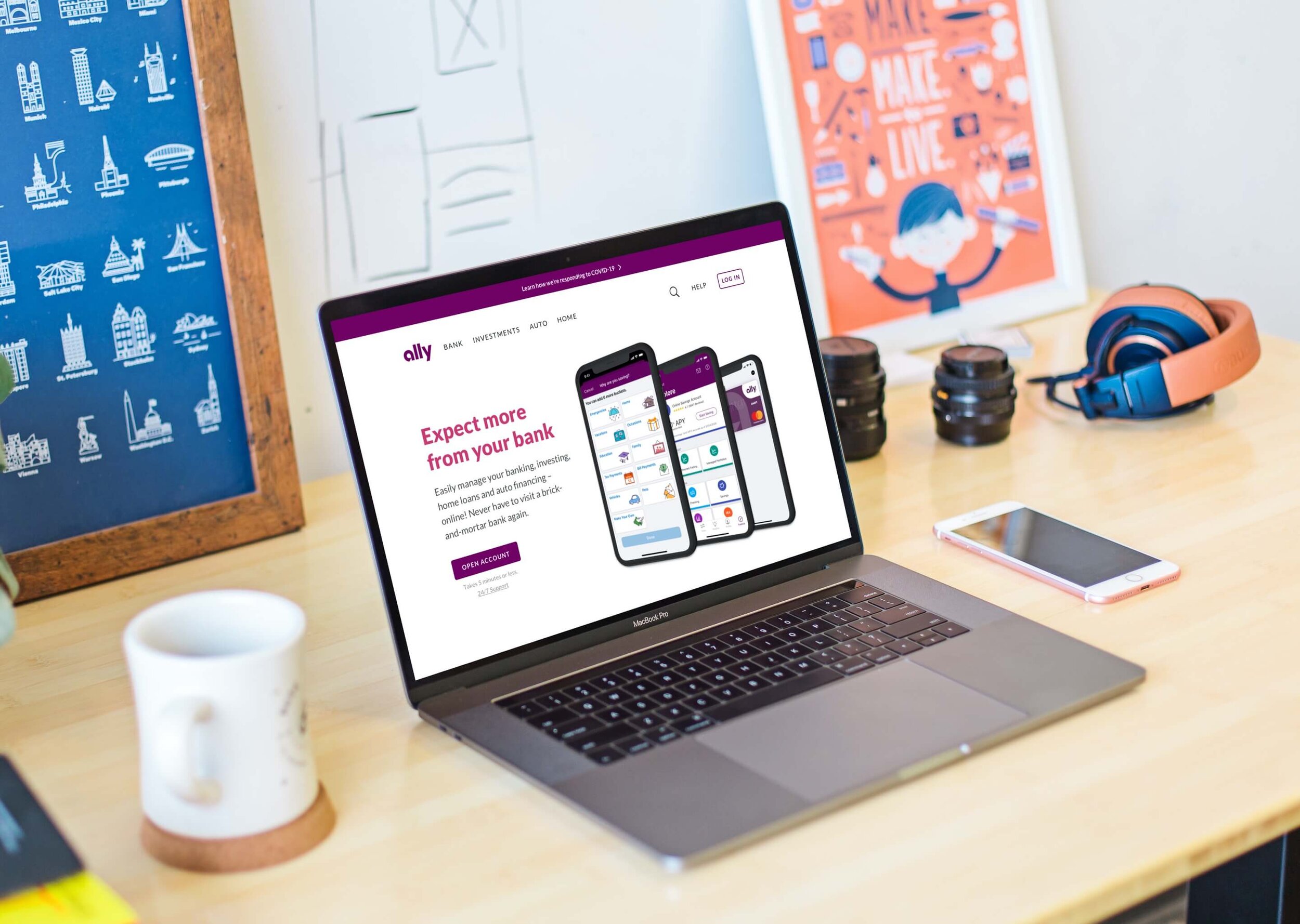
Expect more from your bank
The final homepage presents Ally as one connected digital-finance ecosystem. Product screens, awards, testimonials, clearer service names, and direct actions work together to support the audience most likely to value an online-only bank.
A strong hypothesis is the beginning of testing
This concept combined 3 research sources, 3 proto-personas, and a benchmark of 9 banking apps. Those outputs supported a working audience hypothesis; they didn’t validate it.
My hypothesis is that focusing on people who value an online-only bank and presenting Ally as one connected financial ecosystem would make its services easier to understand and trust.
I’d validate the audience through quantitative and qualitative research, then compare message comprehension, product discovery, task completion, and confidence in the experience. Account openings and completed applications would become meaningful business signals only after the audience and usability assumptions proved sound.
The project reinforced the importance of designing for a primary audience, accommodating others, and remaining willing to change direction when the evidence changes.