Colgate: Using design thinking to create a better website
A design-thinking sprint for Colgate that closes the gap between its smart toothbrush and a website that didn’t match its shine.
01 · Overview
Research visits
Representative users
Task flows
Purchase pathways
Paper prototypes
One preferred direction
Unsolicited redesign
This concept was created independently and is not affiliated with or endorsed by Colgate-Palmolive.
Copyright
Colgate’s name, logo, products, interface, and photography belong to Colgate-Palmolive.
A smart toothbrush deserved a website that felt just as smart
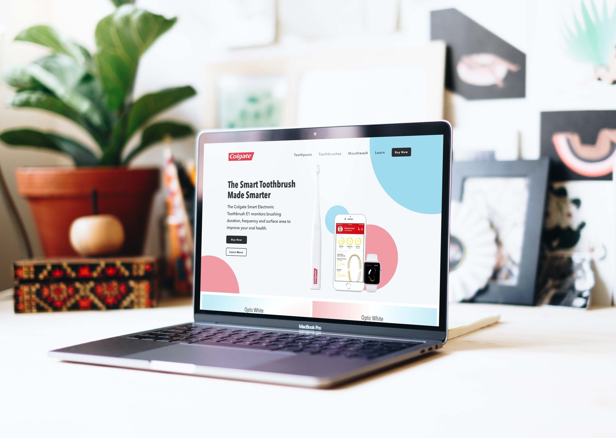
Colgate is a global oral-care brand competing with established companies and newer, technology-led entrants. Its Smart Electronic Toothbrush E1—once sold through Apple—monitored brushing behavior and integrated with Apple devices and ResearchKit, but the website surrounding that product did not deliver the same sense of clarity or innovation.
The disconnect created a broader question: could the homepage make advanced oral care easier to understand while helping people move confidently toward the right products?
A smart toothbrush deserves a website that feels just as smart.
Move from observation to tested structure before polishing the interface
I used Design Thinking to connect competitive evidence, representative-user behavior, architecture, and visual decisions. Unlike several unsolicited redesigns, this study included formative testing: people compared three paper prototypes before I committed to the final wireframe direction.
Empathize
Compare oral-care brands and observe five representative users.
Define
Synthesize pain points into goals, measures, and proto-personas.
Ideate
Sketch the architecture, task flows, homepage, and three testable directions.
Prototype
Build the sitemap, four wire flows, wireframe, style guide, and final homepage.
Test
Use paper prototypes to select a direction, then validate the finished concept in future research.
Compare the category, then watch people use it
I reviewed traditional oral-care competitors and newer brands such as Quip and Burst. The comparison showed how technology-led companies used stronger copy, testimonials, and modern product presentation. Five site visits then grounded that audit in behavior: two focused on Colgate tasks, one on shopping, and two on everyday oral-care routines.
Turn observed friction into a design strategy
I grouped observations into tasks and themes, weighted the most important pain points, and inverted them into user and business goals. Potential measures of time, errors, and satisfaction kept the strategy connected to outcomes rather than aesthetics alone.
Design for a primary audience without erasing the others
The synthesis produced three working audience models. Tina Toothbrush became the primary proto-persona, with Mother Toothpaste and Dr. Mouth as secondary and tertiary audiences. That hierarchy supported a technology-forward direction while preserving broader oral-care needs.
Test the architecture before investing in fidelity
I sketched the sitemap, task flows, and homepage, then created three paper prototypes. Users found the third direction easiest to navigate. That result changed the work before it became expensive: I carried the preferred structure into four detailed task and wire flows and the low-fidelity homepage.
Build a visual system around the product story
The style guide added cool blue to Colgate red and used Avenir Next for a more modern voice. The wireframe also incorporated a newsletter request that emerged during testing, pairing the sign-up with the invitation “Smile Up.”
Make advanced oral care the clearest reason to explore
The completed homepage leads with the smart toothbrush and uses clearer product pathways, purposeful copy, stronger imagery, and proof to connect Colgate’s established brand with a more innovative experience. Each decision traces back to a research finding, a prioritized goal, or feedback from the paper prototypes.
Testing the rough work made the polished work stronger
This project produced observed evidence before moving into high fidelity. I completed 5 research visits, compared 3 paper prototypes, and used the preferred direction to shape 4 task flows. Those findings informed the concept; they don’t prove the final design would improve product discovery or purchase.
My hypothesis is that leading with the smart toothbrush and creating clearer product pathways would make Colgate’s advanced oral-care products easier to understand and explore.
I’d validate the audience with broader research, then test task completion, navigation errors, product comprehension, and confidence in the high-fidelity experience. Product exploration and purchase activity would become meaningful signals only after the core experience proved usable.
The project reinforced that early testing is most valuable when it changes the structure before the design becomes polished.